在Angular中,ng-content指令就像是一个组件中的占位符,使我们可以灵活的插入内容到组件的指定位置,内容可以是简单的字符串,也可以是原生HTML。在其它框架中也有类似的指令,只不过名字不同,在VUE中,它叫Slot。
场景说明
试想一下,我们要开发如下图所示的卡片的组件。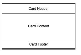
一张卡片包括通常包括:header, content和footer三部分。再假设header和footer部分只放简单的字符串,而content部分我们允许用户根据具体的业务场景放置不同的内容,从简单的字符串到各种复杂的HTML内容。那要怎么做呢?
我们可以把content部分通过ng-content来定义。看下面的代码:
组件定义
组件类定义: widget/card.component.ts
1 | ({ |
组件模板定义: widget/card.comonets.html
1 | <div class="card"> |
注意ng-content的位置
组件使用
定义好组件后就可以在页面使用该组件了。我们仍然使用Todo这个例子,看看使用card组件怎么显示Todo的内容
页面模板代码: todo-card-page.component.html
1 | <div *ngFor = "let todo of todos"> |
注意:我们在app-card之间插入了原生的html代码来显示todo项的内容,但很显然,我们不需要改变Card组件也可以用它来显示其它的业务数据,比如账号,会议,机器等等,因为card组件本身和Todo已经没有什么关系了。
我们可以比较一下在用@Input装饰器为Angular中的组件传值这篇文章中我们显示Todo的做法,其页面显示部分的代码如下:
1 | <div *ngFor = "let todo of todos"> |
乍一看,好像比我们用card还简单些,但当我们去看TodoComponent的定义时,
1 | <div class="card"> |
你会发现,TodoComponent这个组件和Todo这个实体之间是紧密绑定的,我们没办法用TodoComponent来显示别的业务数据,也就是说如果我们想用卡片这种形式来显示不同的业务数据时,就必须重复的定义不同的组件,显然这样的方法是难于扩展和维护的。所以我们应该使用ng-content将形式(card组件的职责)和数据分离。