Angular课程实验手册(三)

在本系列的上一篇文章中,我们在todo-web-app项目中为页面整体的布局(layout)开发了可重用的组件: header和footer(footer是作为课后作业让大家完成的),在本文中,我们将带大家继续深入Angular中的组件,构造一个用于显示业务数据的组件。

我们的实验案例是构造一个管理个人待办事项的应用(todo)。之所以选择这个案例的,是因为这个案例业务上足够简单,大多数人都能理解,这样就不需要在理解业务规则上花太多的时间。当然,我们的案例的Todo是一个比正式应用还要简化的场景,所以无论是数据结构还是算法都更简单。

在开始前,确保你已经进入我们案例项目的更目录: PROJECT_ROOT, 在我的电脑上这个目录是: d:\todo-web-app

建立业务实体类

首先我们建立一个实体类: Todo, 用来表示一个待办事项的实体(数据),在命令行执行以下命令:

1
2
3
D:\todo-web-app>ng g class models\Todo
CREATE src/app/models/todo.spec.ts (146 bytes)
CREATE src/app/models/todo.ts (22 bytes)

执行完成后,项目的目录应该是这样的:

1
2
3
4
5
6
7
8
9
10
11
12
todo-web-app
+ src
+ app
+ components
+ layout
header.component.css
header.component.html
header.component.spec.ts
header.component.ts
+ models
+ todo.ts
+ todo.spec.ts

我们可以看到在src/app/models目录中多了todo.ts这个文件,打开这个文件,添加如下的属性定义在类的定义中:

1
2
3
4
5
6
7
export class Todo {

id: number;
title: string;
desc: string;
done: boolean;
}

构建可重用的卡片组件

为了在页面上显示待办事项的细节信息,我们选择以卡片的方式来展示每一个待办事项。又因为我们不希望卡片和待办事项的业务紧密依赖,影响了卡片组件的复用,因此我们决定使用来构建卡片组件,具体原理可以参考:用ng-content使Angular中的自定义组件更灵活(一)用ng-content使Angular中的自定义组件更灵活(二) 这两篇文章。下面我们描述实验过程:
在命令行执行以下命令构建卡片组件:

1
2
3
4
5
6
D:\todo-web-app>ng g component components\widget\Card
CREATE src/app/components/widget/card/card.component.html (23 bytes)
CREATE src/app/components/widget/card/card.component.spec.ts (614 bytes)
CREATE src/app/components/widget/card/card.component.ts (261 bytes)
CREATE src/app/components/widget/card/card.component.css (0 bytes)
UPDATE src/app/app.module.ts (585 bytes)

执行完成后,项目的目录应该是这样的:

1
2
3
4
5
6
7
8
9
10
11
12
13
14
15
16
17
todo-web-app
+ src
+ app
+ components
+ layout
header.component.css
header.component.html
header.component.spec.ts
header.component.ts
+ widget
card.component.css
card.component.html
card.component.spec.ts
card.component.ts
+ models
+ todo.ts
+ todo.spec.ts

修改组件类定义文件: card.component.ts

1
2
3
4
5
6
7
8
9
10
11
12
13
14
15
16
17
18
import { Component, OnInit, Input } from '@angular/core';

@Component({
selector: 'app-card',
templateUrl: './card.component.html',
styleUrls: ['./card.component.css']
})
export class CardComponent implements OnInit {

@Input()
title: string;

constructor() { }

ngOnInit() {
}

}

在这个文件中,我们只是简单的加入了一个title的属性,因为这个属性是和具体的Todo业务无关的,可以理解为任何卡片都需要一个title。 并且我们将该属性修饰为Input, 标明它是要给输入参数,原理参考: 用@Input装饰器为Angular中的组件传值

接下来,更改组件的显示文件: card.component.html, 首先,删除所有自动生成的内容,然后添加以下内容:

1
2
3
4
5
6
7
8
9
10
11
<div class="card">
<div class="card-header">
{{ title }}
</div>
<div class="card-content">
<ng-content select=".card-content"></ng-content>
</div>
<div class="card-footer">
<ng-content select=".card-footer-toolbar"></ng-content>
</div>
</div>

在显示界面中,我们用绑定了title这个属性,并用ng-conent建立了两个可替换内容的区域。关于可替换的原理,请参考: 用ng-content使Angular中的自定义组件更灵活(一)用ng-content使Angular中的自定义组件更灵活(二) 这两篇文章

最后,为了能够看到效果,我们为卡片组件加上一些CSS, 修改 card.component.css 文件

1
2
3
4
5
6
7
8
9
10
11
12
13
14
.card {
margin: 10px 10px;
border: 1px solid #000000;
}
.card-header {
border: 1px solid #119900;
background: #119900;
}
.card-content {
background: #e7e7f0;
}
.card-footer {
background: #880011;
}

在本文中,CSS主要是要突出效果,以在界面上区分出组件,所以暂时不考虑美观的问题(我们将在后面的文章中来美化)

使用组件

首先,我们在程序入口的app组件中,加入模拟的待办事项数据,修改 apop.component.ts 代码如下:

1
2
3
4
5
6
7
8
9
10
11
12
13
14
15
16
17
18
19
20
21
22
23
24
25
26
27
28
import { Component } from '@angular/core';

import { Todo } from './models/todo';

@Component({
selector: 'app-root',
templateUrl: './app.component.html',
styleUrls: ['./app.component.css']
})
export class AppComponent {
title = 'todo-web-app';

tasks: Todo[] = [
{
"id": 1,
"title": "task1",
"desc": "desc1",
"done": false
},
{
"id": 2,
"title": "task2",
"desc": "desc2",
"done": false
}
]

}

可以看到,我们在代码中引入了实体类Todo, 然后声明了一个todo的数组tasks。

然后修改组件显示文件: app.component.html

1
2
3
4
5
6
7
8
9
10
11
12
13
14
<app-header title="Angular课程"></app-header>
<div>
<div *ngFor="let task of tasks">
<app-card [title]="task.title">
<div class='card-content'>
<div>{{ task.desc }} </div>
<div>{{ task.done }} </div>
</div>
<div class="card-footer-toolbar">
<button>Done</button>
</div>
</app-card>
</div>
</div>

可以看到,我们在html中使用了刚才定义好的card组件(app-card), 用它来显示待办事项。

观看效果

修改完以后,我们执行ng serve运行程序,然后在浏览器中观看效果。如果一切正确,应该可以看到如下界面显示
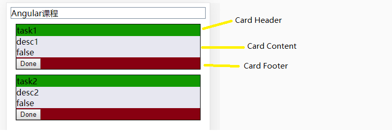
使用卡片组件

下一步

下一篇文章中,我们将带大家实验界面操作并初步引入服务的概念(Service)。

本文标题:Angular课程实验手册(三)

文章作者:Morning Star

发布时间:2019年06月14日 - 10:06

最后更新:2021年04月16日 - 15:04

原始链接:https://www.mls-tech.info/web/angular/angular-practice-manual-3/

许可协议: 署名-非商业性使用-禁止演绎 4.0 国际 转载请保留原文链接及作者。